
Friday, 21 February 2014


.jpg)
Design Brief.
1. After
analysing the results from my questionnaire I have decided to call my magazine
‘Vinyl’. I chose the name vinyl because it is retro and cool, it indicates that
the followers of this magazine are very into their music.
2. The
genre of music which my magazine will focus on will be indie. Indie rock is a genre of music which is made up of a unique mixture of instruments and majority of indie rock musicians write their own music. I chose this genre as their aren't as many popular indie rock music magazines on the market and so I wanted to be original.
3. The
results show that the majority of people want for my magazines house colours to be black, white and orange. These colours put together will give the magazine a unique retro and vintage style look and also help my music magazine to stand out from existing magazines on the market.
4.
My feature article photograph will be of a
single model (artist) and will be the main focus on the front cover. The model won't be holding any props as I want my music magazine to be about the music and so I feel by making the feature article photograph black and white with a musician standing in front of a natural setting it will connote to the reader that this magazine is solely about the music and the musicians story behind their own music.
5.
My magazine will have a formal presentation and
the mode of address will also be reasonably formal. I want for the presentation of my music magazine to be formal and organised so that it looks professional and is artistically eye catching to a reader. I feel that the text within my music magazine must also be formal to some extent yet not so formal that it is unwelcoming or off putting for the reader.
6.
My magazine will include articles about band
interviews and album reviews. The bands interviewed within my magazine will be mostly upcoming artists and the public can request the albums they want reviewed within each issue of the music magazine.
7.
Although the results from my questionnaire
indicate my audience would like a picture for every article included in the
contents page, I have decided to include on a background photo of a live performance as it
will give me more space for information about each article and it will help it to look more professional.
Brief Questionnaire Analysis.
When analysing the answers to my questionnaire, I’ve found
that overall my audience would like my magazine to be professional looking yet
friendly, welcoming and easy to read. 52% of people have agreed that the genre
which my magazine will focus on should be indie rock, this links in nicely with
the 56% of people who agree that the colours used for the text in my magazine
should be black, white and orange, I believe that this fits in well with the
indie genre as the colours are retro. 36% of people have said that the feature
article photograph is the main aspect of the front cover of a magazine which
helps it to stand out, this conveys that my target audience prefer bold
magazines, therefore I will paste a large and eye catching picture as the feature
article photo. Although my target audience would like my magazine to be eye
catching and the text to be friendly, 68% of people would also like my magazine
to come across as being formal compared to using colloquial or humorous
language. The results also show that my audience prefer to read about bands
than single artist and that is the same for what my feature article photo
should be of.


Music Magazine - Questionnaire
What I
have decided
-
My
magazine will stick to three base colours used for different types of texts
e.g. Masthead will be blue as well as the main cover lines whereas less
important text will be black.
-
My
magazine will focus on the genres; rock, metal and indie.
-
My
magazine will stick to a professional and sleek look using black and white writing
and then I will use a brighter colour for the important information.
Questionnaire
1. What genre of music should the
magazine focus on?
□ Indie
□ Rock
□ Metal
□ Alternative
□ Pop
□ Punk
□ Soul
□ House
2. What would you rather the magazine be
called?
□ Vinyl
□ Listen
□ Symbol
□ Manic
3. What colours should I use for text?
□ Black, white & orange
□ Black, white & hot pink
□ Black, white & turquoise
4. What would you rather on the front
cover?
□ A lot of text
□ Only article titles
□ No extra text
5. What do you feel helps a magazine to
stand out?
□ Colour scheme
□ Artist
□ The logo
□ The feature article photo
□ Cover lines
6. How should my front cover be
presented?
□Formal - organised
□ Informal – un-organised
7. What should my feature article photo
be of?
□ A group (band)
□ A single model (artist)
□ Musical object
8. What do you enjoy reading about in an
article?
□ Band interview
□ Gig review
□ Album review
□ Upcoming artists
9. How many pictures should be included
in the contents page?
□ 1 for every article
□ 1 for only main articles
□ None
10.
Should props be used in the feature article
photograph?
□ Yes
□ No
11.
Where should the plugs and extra writing lie
on the front cover?
□ Flush left
□ Flush right
□ Both
12.
How many cover lines should be used on the
front cover?
□ A lot
□ A suitable amount
□ Not a lot
13.
What should the mode of address be?
□ Humorous
□ Formal
□ Colloquial
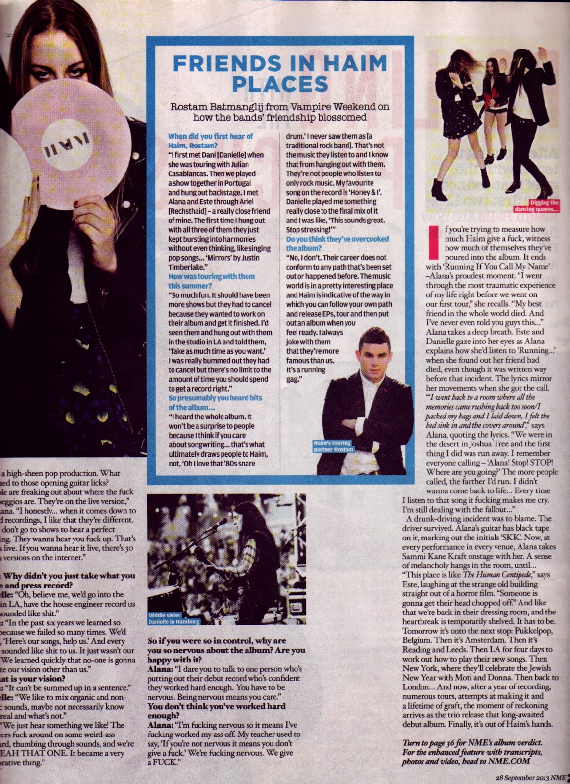


NME Magazine - Double Page Spread Analysis
NME magazine are known for using
a newspaper styled theme throughout their magazine, which gives the magazine a
more professional and organised feel to it. The headline, “It’s about Haim” is
written in a bold black spaced out font, taking up half of the page. The font
used for the headline looks extremely similar to the font used in the ‘NME’ logo
which is affective as it reminds the reader that they are reading NME. The fact
that the headline takes up half the page suggests to the reader that the group
‘Haim’ are relatively new to the spotlight and their rising fame. There is also
a lot of negative space surrounding the article headline, this again highlights
the fact that they are new to fame, the three worded headline also links to the
feature article photograph of the three sisters who make up the band ‘Haim’.
The feature article photograph on the introduction page of the article takes up
an entire page, it is a full body photograph of the three sisters. Each of the
girls have either both or one of their hands in their pockets, they are also
looking down at the reader and two of them have their heads directed slightly
up, and their facial expressions look rather serious compared to their casual
clothing, this makes the reader feel intimidated as though they are ganging up
on us, and gives us the impression that they are laid back rock stars. A bold, blue pull out quote including the
names of the band member who said it written in pink is included beside the
main body of the text containing a swear word which conveys an easy going tone
to the article. The standfirst is written in a skinny, black containing a brief
summary of what the article is about, the authors name has been written in a
bold, pink font to stand out from the standfirst. Included throughout the
article are pictures of the three girls playing live which is good
advertisement for Haim as it conveys their liveliness on stage, there are also
pictures of the three sisters outside of Haim doing their own thing which shows
the reader what they are like as sisters and their close bond. There are also
pictures of each of the girls standing on their own pulling different faces
which shows even though they are sisters they are all different and that’s what
makes the band so different and fun. A time line of the history of the three
sisters is included at the bottom of the article, the time line is called the
‘Haimline’ which dates back to 1986 to 2013. An interview with Haim has been
included in the article which helps the reader to connect with the group, NME
who are asking the questions and the band members name who is answering the
questions is written in a bold black font whereas the answers are written in a
skinny, black font exactly the same as the font used for the main article. Included
in the article are also the three sisters talking about when they met Pharrell
which is written in a white and black text over a pink boxed background. And
also included is a short interview with Haim’s touring partner ‘Rostam’ who
talks about his relationship with the band members and what it was like touring
with them. A short sentence written in italics at the end of the article tells
the reader to turn to a certain page in the magazine to read about NME’s album
verdict for Haim’s new album.


Q Magazine - Double Page Spread Analysis
Q’s style includes using red,
white and black text throughout their magazine, these colours are stylish and
look professional with the way Q use them throughout the magazine. A small red
banner has been included in the introduction page of the article which covers
the top left corner of the feature article photograph, written in the red,
dropped down banner reads “Q the month in music”, the ‘the’ is written in a
skinny, white font whereas the ‘month in music’ is written in a bod white font,
the letter ‘Q’ is shown in opposite way to the way it is written as the logo on
the front cover, a red Q in a white box
allowing it to stand out from the red banner. The feature article photograph is
of ‘John Newman’ with his hair slicked back and wearing black ray ban
sunglasses, a white shirt and a black jacket at the zoo, this conveys to the
reader that he wears stylish clothes no matter where he is. The star is standing in what looks like a
koala bear enclosure, underneath the red banner in the top left corner of the
page reads ‘Grin and bear it: John Newman fails to charm the locals at the Wild
Life Sydney Zoo.’ This links to the photograph included in the article. The
feature article photograph covers both the introduction page of the article and
half of the second page where the article begins. Above the running head is a
banner which reads ‘Q introduces’, the Q is written in a red font whilst the
word introduces in a skinny black font. The running head is included underneath
this, which reads ‘John Newman’ in a bold, black font, allowing the reader to
know straight away who the article is written about. The first letter of the
main body of text has been made big, written in a large, bold, white font
inside a red box, exactly like the Q logo on the front cover of the magazine. A
faded yellow box including John Newman’s guide to ‘Northern soul’ has been
included at the centre of the bottom page beside the main body of text. In the
bottom corner of each article page, Q have include the date the issue was
written, the page number and the letter Q reminding the reader, what they are
reading, how up to date the article is and what page they are on. A pull-out
quote written in a bold, black font inside a pale, yellow box has been included
within the article which reads, “The brain tumour gave me a kick in the arse.”
This gives the reader an insight in John Newman’s life and also a connection
with the star they are reading about.
Kerrang Magazine - Contents Page Analysis

A black worn out
looking circle in the top right hand corner contains the word ‘contents’ in a
large white font size. The black background to the word ‘contents’ is used so
that it stands out from the white background to the page. The editor of the
magazine has written and signed a small paragraph about the issue flush left of
the page, this is nice as the reader can compare their own thoughts on the
issue of the magazine and allows the magazine to be a lot more down to earth
and welcoming to the reader. A picture of the editor holding a megaphone up to
his face has been included above the paragraph which links back to the feature
article photograph on the front cover of ‘Sleeping with Sirens’. There is a large photo at the top of the page
flush left of a man crouching down and holding a microphone I can only guess
that he is singing at a gig and he is crouching down to the audience. The issue
number and cover date is provide in black and red at the top, flush left of the
page above the main picture in the contents page. The three main articles have
their page number provided in a large, white font covering a corner of the
picture given for that article. A small paragraph about who helped to create
the issue is provided at the bottom right hand side of the page, this is useful
as it creates a slight connection between the reader and the creators of the
magazine. The headlines feedback, news, features, shots, lives, albums, gig
guide and the ultimate goblin test have been included in the contents page to
help organise where each article is included in the issue, this is helpful for
the reader as it makes it easy for them to find where each article is in the
magazine.
Q Magazine - Contents Page Analysis

NME Magazine - Contents Page Analysis

The contents page for this issue
of NME is very professional looking, for every issue of NME, ‘inside this week’
is written using the Times new roman font and made it a large font size so that
it stands out. This gives the magazine a newspaper like feel, adding to the professional
look of the magazine. The current date of when the issue was sold is written in
a smaller font size under the title of the contents page, this is helpful for
the reader as they can then know what date it is. The page numbers for each
article are written in bold, red writing to stand out from the black and white
background and writing, they also make it so that the corner which the number
is written on covers that area of the picture so that the corner of the picture
has disappeared. Quotations from each article have been included underneath
photos included in the article to advertise each article included in the
magazine. An advert to subscribe to NME with a discount has been included at
the bottom right hand side of the page written over a red background to stand
out, to help advertise the magazine they have placed pictures of other issues
of the magazine to show what else they write about, this then helps the
magazine to branch out to a wider audience. The layout of the contents page is
rather formal with some contents flush left and some flush right. The most
important article is shown at the centre of the page using a larger picture and
quotation from the article. The less important articles are highlighted at the
bottom of the page as a strip and in writing above the smaller articles says
‘plus’ in black font. The information in the contents page is over a plain
white background with minimum negative space. Pictures of each article are
provided above each page number to show who you are reading about. Thin black lines have been placed to divide
each article written about in the contents page so that the reader can identify
when another article is being written about. The layout of the contents page is
relatively neat with three pictures flush left, with quotes from the article
written underneath in a clack font. The picture top left of the page has bold
black writing for the quote and so does the bottom picture flush left of the
page, yet the quotation for the picture in the middle flush left has been
written in a skinny black font yet still the same font size.
Kerrang Magazine - Front Cover Analysis

Kerrang is a magazine
directed towards young male teenagers who enjoy rock music and look up to being
like the men in bands. The cover article photo is of five men, one of them is a
lot more forward than the others and his head covers the ‘R’ and ‘A’ in the
masthead which spells out ‘Kerrang!.’ The man who is more forward than the rest
holds a megaphone and looks as though he shouting down it, from this I can only
guess that he is the main band member, the singer. The main band member’s hair
is long and black, whilst he is wearing a thick metal ring, black trousers and
a black short sleeve t-shirt which allows him to show off his tattoos, this
makes the reader feel slightly intimidated by him and gives him a rebel image.
His most obvious tattoo to the reader is of a cross and what looks like weeping
angel, this also adds to his dark image and gives the magazine a slight gothic
feel to it. There are an echo of rings placed in the background of the magazine
cover, highlighting the fact that the main band member is shouting into the
megaphone and ‘sleeping with sirens’ are ‘here to wake up your town!’. The four
band members in the background are all wearing and look different to each
other, not only because they are pulling different faces to one another but
because of the way they are dressed and standing in comparison the main band
member, this allows the target audience to expand slightly as they are all
different looking people. The band member to the far left is sticking his
tongue out and is wearing a plain white t-shirt, he is throwing his hands up as
though he doesn’t care and just wants to have fun. The band member second from
the left is wearing a backwards cap, has stretched ear lobes and is wearing a
black leather jacket which he is holding closed in a relaxed fashion but also
makes the reader feel intimidated as he looks like a rebel. The band member
second from right is wearing a backwards cap, jeans, a shirt and a jacket this
allows him to look a lot more casual and chilled out, yet he has necks tattoos
which make him look rebellious. Whilst the band member to the far right is
wearing a patterned shirt and is smiling at the reader whilst making a rock on
hand gesture this makes him look relaxed. The band’s name ‘sleeping with
sirens’ is written all in capitals in a large white font, it also has a yellow
shadow boarder making it look as though it is coming out of the page, this
shows the bands importance. The background to the magazine cover is a dark red
with small splodges od black colouring which makes it look dirty adding to the
rock star, rebellion feel to the overall magazine as it looks careless yet
cool, which is what rock stars are known to be like. There is a yellow strip at the top of the
page advertising the ‘pull-out’ poster of Green Day found inside the magazine,
this is useful as it helps to sell the magazine, to help the advertisement of
the poster they have also included a picture of Green Day to the right of the
yellow strip. There is also a yellow strip at the bottom of the page with the
word ‘plus!’ written in red font to get the reader’s attention to what else is
included in the magazine. A picture of My Chemical Romance has been included at
the bottom of the cover to advertise the ‘massive encyclopedia’ included in the
magazine. Above what’s written about My Chemical Romance the red background
looks as though it has been torn and the writing about the band has been
written over a black background this allows it to stand out and the torn effect
on the red background adds to the rebellious look of the magazine.
NME Magazine - Front Cover Analysis

NME are known for their stylish red, white and black theme
in most issues, the magazines target audience are teenagers and young adults.
The large red masthead reading ‘NME’ links with the use of red text in the
cover line and for individual quotes by Haim included in their article. Due to
the fact that the covers main focus is on Haim then as a reader I get the
impression that ‘Haim’ are new to the limelight. The cover for this particular
issue doesn’t contain a large amount of writing, the feature article photograph
takes up the majority of space on the cover. The feature article photo is of
three girls in their twenties, who when reading the quotations included by them
find out that they are sisters. The girl to the left has her mouth slightly
open and this conveys excitement to the reader, she is wearing shorts and a
leather biker jacket which shows that they are casual but ready to rock. The
girl flush right has one arm resting on the back of the girl in the middle, and
she is smiling which is welcoming for the reader inviting them to read their
article, she is wearing a black suit, but the way she stands portrays to the
reader that she is relaxed which fits in with the way we perceive a rock star
to be. The girl in the middle is bending down and holding an old camera up to
her face as though she is taking a picture and to highlight this, a thin black
frame has been included surround the three girls as though it is a picture of
them. The only other information included on the cover are names of other
artists written about in this issue of the magazine, but to highlight the fact
that this issue of the magazine is focusing on ‘Haim’, the names of the other artist
are written round the outside of the frame including the feature article photo.
The background of the cover is white, which is classy and stylish, it also
helps to convey that because ‘Haim’ are an upcoming band they don’t know what
to expect until you read the article included within the magazine. The
individual quotations from the band members are included beside them in white
boxes with a black frame. These boxes cover parts of the cover so that they
stand out, for example, the bottom right hand corner of the masthead is covered
by one of the boxes of text so that you can see it over everything else. The
cover lines also have boxes around and also cover the feature article photo so
that they stand out.
Q Magazine - Front Cover Analysis

Wednesday, 19 February 2014
Identify Competitor Music Magazines.
Part of my research is to analyse existing popular music
magazines and their front covers, contents pages and double page spreads. I must
choose three magazines with a similar aim and genre to mine. Therefore I have
chosen to evaluate and analyse NME, Kerrang and Q. These three magazines are
all very popular with a similar music genre yet NME is aimed at young adult
women, Q is aimed at men and women of the age 25 – 35 whilst Kerrang is aimed
at an alternative teenage audience. All three magazines will be my competitors
on the market as they all surround the rock genre yet in their own individual
ways to reach their target audience. Although my magazine will be of a similar
genre to NME, Q and Kerrang my music magazine will base its articles and news
on upcoming artists in the indie music world as I want my music magazine to
inspire people. However the audience for my music magazine will mostly be
musicians and most definitely music lovers as my music magazine will be mostly about the music
itself and less about fame whereas NME, Q and Kerrang not only write about the
music but more about the famous musicians that they are interviewing.
Genre.
My music
magazine will surround an indie rock genre. Indie rock came about in the 1980s
in the United Kingdom and the United States, it is a genre of alternative rock.
Indie rock musicians are known for their unique combination of less used
instruments. Indie rock is a mixture of many
other genres, including alternative rock, folk music, and electronica, even
pop. It also tends to be very positive music, despite popular opinion. Every
sound within an indie rock song is made by a specific instrument they do not
use artificial sounds. Indie music is natural created only using instruments
and one’s voice. The majority of indie rock has a meaning behind it and majority
of indie rock musicians write their own music. I have chosen to base my music magazine
around the indie rock genre because I feel that it is the most beautiful genre
of music because it comes from the
musicians heart, and shows true passion towards music. Indie rock musicians
care more about the instruments and the music than the fame that may or may not
come with it. You have to explore the world of indie rock and find your own niche
within the genre as there are so many different artists conveying their passion
for music in their own unique way with either the instruments that they use or
the words that they sing. I know that
when I listen to indie music it inspires me to chase my dreams as a musician as
the genre holds so much meaning. Due to the fact that I want my music magazine
to inspire young musicians I feel that the indie rock genre will fit my
magazine perfectly, including upcoming less well known artists that convey
their passion for music in their own way, inspiring others as they do.
Target Audience.
My music magazine will be targeted at music lovers around
Great Britain, my magazine will reach out to a
chilled out yet an indie rock loving audience as my music magazine will
surround the topic of the art of music and how music can build you as a person
instead of just the music itself. My music magazine will reach out to a
passionate audience, an audience that both look beyond the words sung, too the
instruments being played beautifully yet also feel the capturing words being
sung by our loved musicians. My music magazine will highlight and capture the
simplistic beauty which music holds. I believe the audience of my magazine listen
to music that they can use as a soundtrack to their own lives, music sung by
musicians and artists that may not be well known for their fame, but are well
known for the music they make. The audience for my music magazine will be
musicians themselves looking for upcoming musicians to inspire them and allow
them to read about the journey which they have taken to get where they are in
the music world. I feel that my audience will mostly consist of acoustic guitar
players, ukulele players and any folk instruments. I believe that all kinds of
young rock bands will be interested in my music magazine as well. Due to this, I feel that the audience of my
magazine are late teens and young adults that aspire to be well known musicians
as either solo artists or in a band. I feel that the gender of my audience will
be nice and mixed but I believe that a lot of the younger audience will be
female as they are looking to be inspired. I also feel that my magazine will
reach out to people in their twenties into their thirties yet also maybe men
and women in their forties. My audience won’t need to be highly educated to be
able to read my magazine but will need to have a strong passion for music and
instruments to be able to read and enjoy it.
Original Brief.
Our task is to create our very own music magazine including
a front cover, contents page and double page spread. It must follow a specific
genre of our choice and must be targeted to a desired audience. I will use my
blog to post any relevant research that will help me with the construction of
my music magazine. I will analyse existing popular music magazines and their
front covers, contents pages and double page spreads this will in turn help me
to identify what it is that makes a music magazine sell and what doesn’t. The
magazines which I choose to evaluate will be based on the genre that I decide
to have my magazine based upon. By evaluating a number of magazines it will
allow me to identify what is conventional for a music magazine and what aspects
go against conventions and how either can benefit my music magazine or
effectively ruin its reputation on the market. After collecting relevant
information about existing music magazines, I will put together an audience
survey which will help me to identify what my magazines audience will be like
and what they want to see within my music magazine. The questionnaire will ask
about the genre of the magazine, the magazines name, house colours etc. The
questionnaire/audience survey will help me to create the requested music
magazine for my audience. I will then put together a design brief based on all
the research I have collected about the creation of a popular and successful
music magazine which will help me to collect all of the information for when I
construct the magazine. Finally before I begin making my music magazine, I will
sketch out different ideas for my front cover, contents page and double page
spread and out of the drawings I make I will choose the preferred one and keep
to that design as much as I can making alterations as I go. Once I have
completed my front cover, contents page and double page spread of my music
magazine I will create a detailed evaluation that will include my thoughts and
ideas when creating my music magazine and my reasons for creating the magazine
in the way I did.
Tuesday, 18 February 2014


Subscribe to:
Comments (Atom)