Friday, 23 May 2014

Tuesday, 15 April 2014


Friday, 21 February 2014


.jpg)
Design Brief.
1. After
analysing the results from my questionnaire I have decided to call my magazine
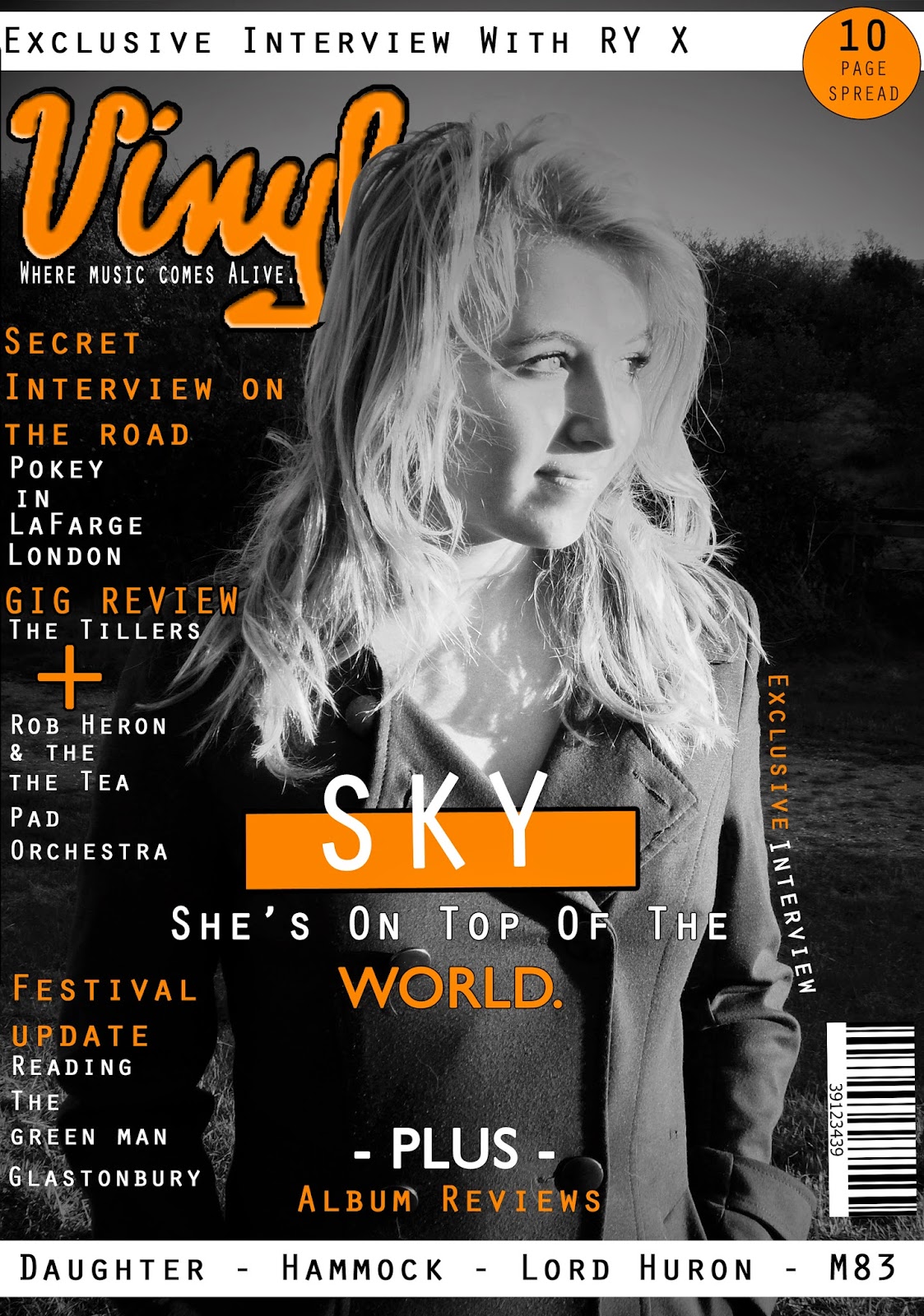
‘Vinyl’. I chose the name vinyl because it is retro and cool, it indicates that
the followers of this magazine are very into their music.
2. The
genre of music which my magazine will focus on will be indie. Indie rock is a genre of music which is made up of a unique mixture of instruments and majority of indie rock musicians write their own music. I chose this genre as their aren't as many popular indie rock music magazines on the market and so I wanted to be original.
3. The
results show that the majority of people want for my magazines house colours to be black, white and orange. These colours put together will give the magazine a unique retro and vintage style look and also help my music magazine to stand out from existing magazines on the market.
4.
My feature article photograph will be of a
single model (artist) and will be the main focus on the front cover. The model won't be holding any props as I want my music magazine to be about the music and so I feel by making the feature article photograph black and white with a musician standing in front of a natural setting it will connote to the reader that this magazine is solely about the music and the musicians story behind their own music.
5.
My magazine will have a formal presentation and
the mode of address will also be reasonably formal. I want for the presentation of my music magazine to be formal and organised so that it looks professional and is artistically eye catching to a reader. I feel that the text within my music magazine must also be formal to some extent yet not so formal that it is unwelcoming or off putting for the reader.
6.
My magazine will include articles about band
interviews and album reviews. The bands interviewed within my magazine will be mostly upcoming artists and the public can request the albums they want reviewed within each issue of the music magazine.
7.
Although the results from my questionnaire
indicate my audience would like a picture for every article included in the
contents page, I have decided to include on a background photo of a live performance as it
will give me more space for information about each article and it will help it to look more professional.
Brief Questionnaire Analysis.
When analysing the answers to my questionnaire, I’ve found
that overall my audience would like my magazine to be professional looking yet
friendly, welcoming and easy to read. 52% of people have agreed that the genre
which my magazine will focus on should be indie rock, this links in nicely with
the 56% of people who agree that the colours used for the text in my magazine
should be black, white and orange, I believe that this fits in well with the
indie genre as the colours are retro. 36% of people have said that the feature
article photograph is the main aspect of the front cover of a magazine which
helps it to stand out, this conveys that my target audience prefer bold
magazines, therefore I will paste a large and eye catching picture as the feature
article photo. Although my target audience would like my magazine to be eye
catching and the text to be friendly, 68% of people would also like my magazine
to come across as being formal compared to using colloquial or humorous
language. The results also show that my audience prefer to read about bands
than single artist and that is the same for what my feature article photo
should be of.


Subscribe to:
Posts (Atom)